In his book Visible Signs, David Crow delineates three semiotic categories: iconic, index, and symbolic identities. An iconic identity is characterized by a resemblance to the true meaning of the sign itself; for instance, the Burger King logo aligns harmoniously with its logotype and product offerings. In contrast, an index identity is defined by a direct link between the sign and its referent, establishing a connection to the physical reality in which it exists. A symbolic identity, on the other hand, lacks a correlation between the logogram and its logotype. As Crow notes,
“There is a direct link between the sign and the object. They have a direct link to the physical reality of where they are placed” (Crow, 2007).
In this assignment, I aimed to explore how the Dropbox logo might be transformed into an iconic identity. Dropbox, a leader in the file hosting platform industry, undertook a significant rebranding of its logo in 2017. This project was executed in collaboration with Collins, a prominent U.S. design agency that worked closely with Dropbox’s in-house design team. The new logo features a simple, minimalist representation of an open box, effectively communicating the brand’s core functionality. This design facilitates immediate recognition, as it is well contextualized within the service it represents. In this context, the Dropbox logo can be classified as an index identity. Its straightforward design not only conveys the essence of the service it represents but also fosters a tangible connection between the brand and its functionality in the digital storage landscape.

Source : https://logos-world.net/dropbox-logo/
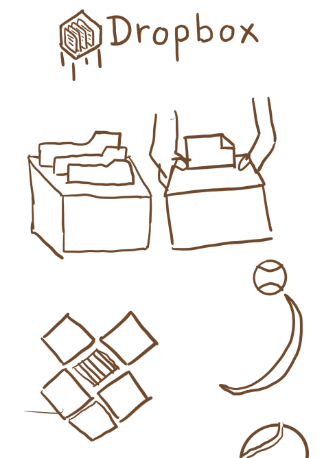
To begin, I investigated what a “drop box” would look like in real life, creating initial sketches to visualize my ideas.

I sought to incorporate elements that represented documents, an open box, and the action of dropping, aligning with both the name and the service. After several explorations, I settled on a final version that features a document rendered in a sans-serif typeface, maintaining a modern and open aesthetic. This approach not only reflects the essence of Dropbox’s functionality but also enhances its visual identity as an iconic representation.

Reference :
Crow, D (2007) Visible Sign. Lausanne : AVA Publishing
Jenny Brewer. (4 October 2017). The Dropbox rebrand features a logo update, new typography and vibrant illustration collaborations. https://www.itsnicethat.com/news/dropbox-rebrand-collins-graphic-design-041017 (Accessed October 7th, 2024)
Leave a Reply